Teardown · conversion analysis
Cal.com's landing is a pitch to everyone at once.
On a phone it scores 49, and its own headline — plain text — can take nine seconds to paint while the main thread stays busy for nearly thirteen. And before any of that, the hero tries to talk to individuals, businesses and developers in one sentence.
TL;DR
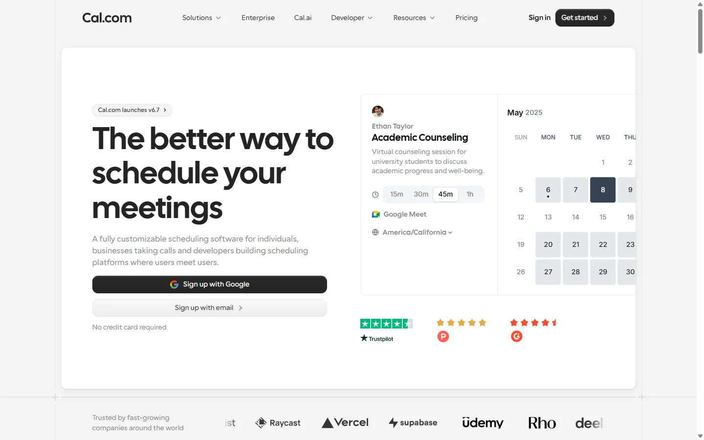
the skim-reader's exit- The hero headline — "The better way to schedule your meetings" — is followed by a sub-line naming three audiences at once: individuals, businesses "taking calls," and developers "building scheduling platforms." It is trying not to leave anyone out.
- The ask is loud and doubled: "Get started" appears nine times, "Book a demo" / "Talk to sales" seven more, and the top nav is pinned for the whole scroll.
- The page is a no-code Framer export — the generator tag says so — carrying 43 eager-loaded images, a Twitter/X ad pixel, PostHog (×3) and a Senja testimonials widget across ≈ 1.5 MB.
- On a mid-range phone that costs Performance 49 / 100 (median of nine runs; 41–69), a median LCP of 9.0 s, 12.7 s of main-thread work and 6.3 s of JavaScript bootup.
- It is not falling over: CLS 0.001 — the layout is rock-stable, and the hero has a single, clear
<h1>. The problems here are choices, not accidents.
A hero that widens to fit everyone — on a company whose whole edge is being the sharp, developer-first choice. The segmentation exists one click into their own nav; the front door flattens it.
Why this subject
scope of the readCal.com's own tagline is "scheduling infrastructure for absolutely everyone," and its nav sells to engineers: a public API, "Scheduling Components" (React atoms you drop into your own app), OAuth clients, developer docs. It raised a $25M Series A led by Seven Seven Six in 2022, and it counts Vercel, Supabase and Deel among the logos on its own page. In April 2026 it did two things that make its marketing site interesting to measure: it moved the product closed-source, publicly citing security — open code, the company argued, hands AI-assisted attackers an advantage — and it shipped a changelog headlining a "20× performance boost" to the in-app bookings page.
We take no position on the licensing debate — that isn't our lane. But a company that has just staked its name on engineering rigor invites the obvious test: the homepage is the one piece of software every prospect runs before they trust any of the others. So we ran it, on a phone, the way most first-time visitors will. We measured a full snapshot of cal.com — the rendered DOM and Lighthouse runs — first on 2026-07-11 and re-measured for publication on 2026-07-23; the page was materially unchanged. We did not see the funnel behind it. Where we can only guess, we say so.
Fairness note: the "20×" claim is about the product's bookings page, a different surface — not a claim that the marketing homepage is fast. The contrast we draw is that the rigor visible in the product isn't visible on the shopfront, not that anyone lied about the homepage.
What they're doing right
taste before critiqueFive wins, all on the snapshot.
The first ask is the right one.
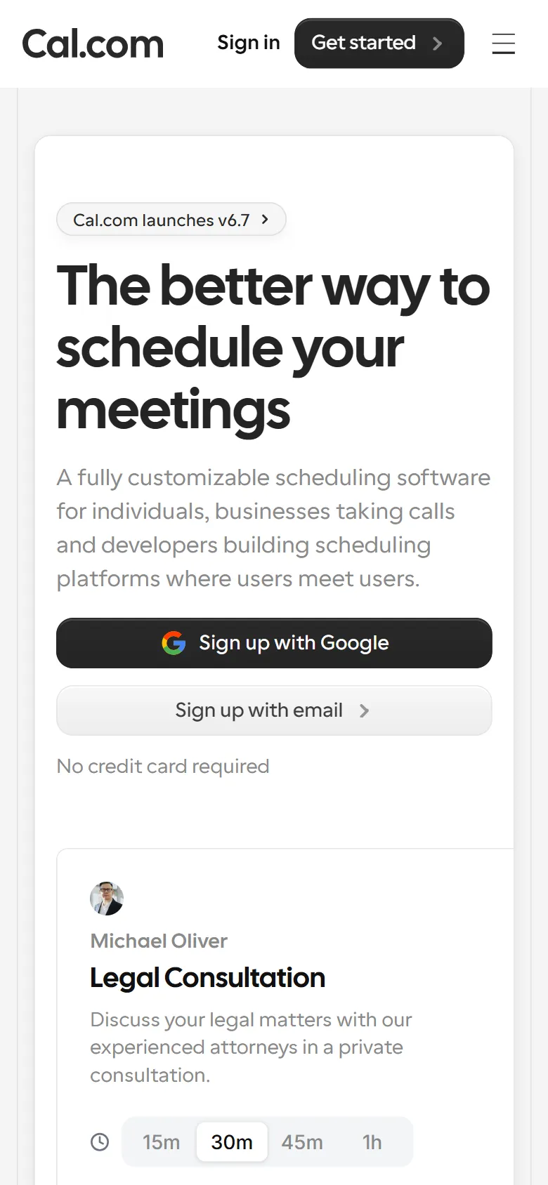
The hero doesn't bounce you to a form on another page — it puts "Sign up with Google" and "Sign up with email" right there, with "No credit card required" underneath. For a free-tier-led product, that's the correct opening move: let people in before you ask them anything.
The proof is real and on-brand.
The logo strip runs Vercel, Supabase, Raycast, Deel — developer-and-startup brands a technical audience actually weighs, not anonymous "Fortune 500" mush. The Trustpilot, G2 and Product Hunt marks beneath the hero are third-party, checkable proof rather than self-assigned adjectives.
One clear promise, one <h1>.
"The better way to schedule your meetings" is plain and singular. Exactly one <h1> on the page; no heading-salad competing for the crawler or the reader.
The layout is stable.
CLS 0.001 — near the theoretical floor. Whatever else loads, the page doesn't jump under your thumb. Framer earns its keep here; this is the part a no-code builder is genuinely good at.
The audience model is thought-through.
The nav segments Solutions by team size (Individuals / Teams / Organizations / Enterprises) and by use-case (Recruiting, Sales, HR, Education, Support, Healthcare, Telehealth, Marketing). The understanding of who buys this is clearly there. The homepage just doesn't use it — which is the whole of Observation 1.
Observations
five, measuredThe hero tries to speak to everyone.
h1 "The better way to schedule your meetings" · sub-line names 3 audiences in one sentence · in-hero CTAs: Google + email signup
The headline is fine — plain, benefit-first. The sentence under it is where the focus leaks: "A fully customizable scheduling software for individuals, businesses taking calls and developers building scheduling platforms where users meet users." That's three products' worth of promise in one breath. A solo founder booking sales calls, an ops team, and an engineer embedding a booking widget do not want the same first sentence — and Cal.com clearly knows this, because its own nav splits those audiences a dozen ways. The breadth that belongs on a /solutions index has been poured into the hero.
We can't see their funnel; it's possible the generic hero out-converts a segmented one across a genuinely multi-segment audience, and that breadth is deliberate. But "customizable scheduling software for everyone" is a sentence Calendly could run too. Cal.com's edge is being the developer-first, open-heritage choice — and the hero spends its most valuable line not saying so.
RecommendationPick the one audience the rest of the funnel is worst at reaching — likely the developer/platform buyer, the differentiator versus Calendly — and let the hero say that; push the "for everyone" breadth down one row.
The ask is loud, and doubled.
"Get started" ×9 · "Book a demo" / "Talk to sales" ×7 · top nav position: fixed the whole scroll
Credit first: unlike a pure top-of-funnel site, Cal.com puts the actual signup in the hero, so the primary ask is real, not a link to a link. The issue is volume and forking. "Get started" fires nine times; alongside it, "Book a demo" / "Talk to sales" fires seven — a second, sales-led path running in parallel the whole way down, never visibly tied to who should take it. Self-serve and sales-assist are both valid, but presented shoulder-to-shoulder nine-plus times they read as the page hedging between "sign yourself up" and "let us call you."
RecommendationKeep the pinned "Get started," but gate the demo path behind the segments that need it (Organizations / Enterprise) rather than repeating it beside every self-serve CTA.
Twelve thousand pixels, and it starts repeating.
The page carries nine <h2>s — eight content sections plus the wordmark. Two of the eight are testimonial blocks; one is literally titled "…and so much more!" By the time a visitor has scrolled a dozen phone-screens, the page is restating enthusiasm rather than adding argument. Length isn't the sin — unearned length is.
RecommendationMerge the two social-proof blocks into one, cut "…and so much more!", and hold the page to the four sections that actually move a decision: promise, how-it-works, proof, price.
The front door is a no-code build, and the phone can tell.
Framer is a fine tool, and the stability (CLS 0.001) shows its strengths. But a no-code export defaults to eager-everything, and it shows: Lighthouse flags 219 KiB of offscreen images that should defer and 157 KiB of unused JavaScript, and the main thread stays busy for 12.7 seconds. The largest-contentful-paint element is the hero headline itself — plain text — and even that waits on the JavaScript storm: a median 9.0 s to paint, and the score swings from 41 to 69 depending on whether the main thread happens to free up in time. This is the surface where the "engineering rigor" story gets tested by anyone on a mid-range Android, and 49 / 100 is mid-pack for a company whose pitch is that it sweats exactly this kind of detail. (These are throttled lab numbers, not field data; Cal.com's real users skew desktop-and-developer, so their field experience may be better. The lab is still what a cold mobile prospect gets.)
RecommendationThe single highest-leverage fix is free inside Framer — lazy-load everything below the fold (the 43 → a handful) and drop one of the three analytics scripts. That alone should move LCP and main-thread time materially, without a redesign.
The small stuff that undercuts a rigor brand.
Best-Practices 75 / 100 · Accessibility 92 / 100
Lighthouse flags, on the shopfront of a company that just went closed-source for security: 7 third-party cookies, 4 JavaScript errors logged to the console, and an issue in the DevTools Issues panel. On accessibility — for a tool people book appointments with on their phones — it flags 53 elements with insufficient colour contrast and 2 links with no discernible name. None is fatal; all are the kind of thing a rigorous team fixes on its own front page. (To be fair, the image-alt audit passes — the decorative images are correctly marked empty, so this isn't a sloppy-markup story. The gaps are specific and nameable, not general rot.)
RecommendationClear the four console errors and the two unnamed links first — both are quick, and both are visible to any engineer who opens DevTools on your homepage. Which is to say: to your buyer.
Alternative directions
explorations, not prescriptionsTwo directions we'd test — Cal.com's own data may vindicate the control.
Alt A · Observations 1 + 2
The segmented hero.
Lead with one audience. Given the differentiator, make it the developer/platform buyer: a hero that says, roughly, "Scheduling your users can book inside your product," with the API and React atoms as the hero proof, and a secondary row that fans out to the other segments. The self-serve signup stays exactly where it is; the sentence stops apologizing for its own focus. We don't mock up Cal.com's page with invented copy in their mouth — this is a direction, not a finished screen.
Alt B · Observations 3 + 4
Practice what you preach.
Two honest paths. The cheap one: stay on Framer, but treat the export like production — lazy-load below the fold, size the images, drop a script, and cut the page to four sections. The on-brand one: for a company selling scheduling infrastructure to developers, a hand-built homepage that scores 95+ on mobile would itself be the proof — the front door as a live demo of the care the product claims.
What we'd test first
one experiment, scopedThe segmented hero, before anything else. Variant: the developer-first hero from Alt A — new headline, new sub-line, hero proof swapped to the API/atoms. Control: the current "for everyone" hero. Primary metric: signup-starts per session, the in-hero Google/email path. Guardrail: demo-request rate must not fall — if the broad hero is quietly feeding the sales pipeline, we need to see that before we commit. Two weeks or one full traffic cycle, whichever is longer.
We'd pick this test because the hero is the one section every visitor renders, the change is one component, and the result adjudicates the page's central choice: does breadth out-convert focus for a developer-first brand?
Why this matters
zoom outYour homepage is the one piece of your software every prospect runs before they trust the rest. When your entire pitch is engineering rigor — closed-source for security, a 20× speedup in the product — the front door does double duty: it has to sell, and it has to be evidence. Cal.com converts on brand and proof despite the front door, not because of it; a stable, no-code page with a speaks-to-everyone hero is a page that works when the buyer already knows you.
The harder, more valuable version is the page that earns the engineer meeting you for the first time, on a phone, with DevTools one keystroke away. Focus the sentence. Lazy-load the images. Clear the console. The discipline is already in the product — it just hasn't reached the doormat.