Teardown · conversion analysis
Linear's landing is a conviction bet.
216 words of copy and two signup links across twelve screens. We measured what that confidence buys — and what it leaves unasked.
TL;DR
the skim-reader's exit- The discipline is countable: an 8-word h1, five chapter intros of 18–21 words each, a 216-word persuasion layer across a 10,781-pixel page.
- The product does the talking: all five feature mockups are live DOM — zero
<video>elements — threaded by one fictional company whose bug travels from a Slack thread to a merged diff. Layout shift: 0. - The conversion architecture trusts the nav: no ask in the hero, two signup links on the entire page, the first in-flow CTA at 93% of the scroll.
- Proof front-loads, then disappears: 8 customer logos at 13% depth, then ≈7,600 px — 70% of the page — without a customer name, number, or ask. The only quantified claim lands at 89%.
- The lab disagrees with the brand: Lighthouse LCP 21.3 s mobile, and the LCP image ships
loading="lazy"— Lighthouse's own lazy-LCP audit fails.
An ask that's everywhere and nowhere: a "Sign up" pill pinned in the fixed nav the whole scroll, but no contextual ask until 93% — never at the moment the demo has just won you.
Why this subject
scope of the readLinear began as an issue tracker; today its h1 sells "The product development system for teams and agents," and on the day we captured it a hero banner declared the category it led — issue tracking — dead. That is the hardest move in B2B positioning: repositioning in public, mid-flight, with 33,000+ product teams watching.
So we measured the page that has to pull it off — a full snapshot of linear.app on 2026-06-11 at desktop 1440 and mobile 390, the rendered DOM, and Lighthouse runs we re-confirmed against the live page on 2026-06-14. We did not analyze the funnel behind it: no conversion data, nothing behind the login. Where we can only guess, we say so. What follows: four things worth copying, six observations, and three directions we'd test.
What they're doing right
taste before critiqueFour wins, all measured on the snapshot.
Copy restraint you can count.
The h1 runs 8 words; the subhead 11. Each of the five capability chapters — Intake, Plan, Build, Diffs, Monitor — opens with a verb-led heading and an intro of 18–21 words; 97 words cover all five. The whole persuasion layer — h1, subhead, manifesto, three principle cards, five chapter headings and their paragraphs — totals 216 words. Most of the page's ≈1,300 visible words belong to the demo UIs, not to claims about them.
The demo is the argument.
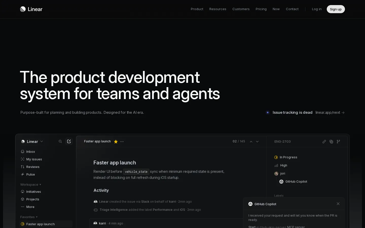
The five product mockups are not screenshots or video — the captured DOM contains zero <video> elements, and the mockup text is real, selectable page text. They run one continuous story: a fictional company whose iOS startup bug travels from a Slack thread into an issue, through an agent's pull request, into the diff that fixes it. Despite animation running through all of it, cumulative layout shift measures 0 on every Lighthouse run. The animated h1 even ships a visually-hidden plain copy for screen readers — care spent where nobody looks.
Logos where the doubt is.
Eight customers — Vercel, Cursor, Oscar, OpenAI, Coinbase, Cash App, Boom, Ramp — sit 13% into the page, about 1.5 screens down, exactly where "who else uses this" gets asked.

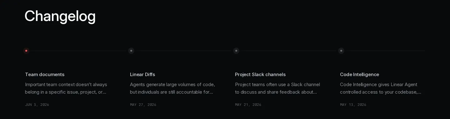
Dates instead of adjectives.
A changelog strip shows four dated releases between May 13 and June 3, 2026 — shipping velocity demonstrated, not claimed.
Observations
six, measuredThe hero asks for nothing.

h1 8 words · subhead 11 words · CTA buttons above the fold 0 · /signup links on the whole page 2 · first in-flow CTA at 93% scroll
The hero holds an 8-word h1, an 11-word subhead, one campaign link — and no CTA. The only conversion control above the fold is the "Sign up" pill in the nav corner. The whole 10,781-pixel page contains two links to /signup; the first inside the page flow appears at 93% of the scroll. On mobile, where the campaign link is dropped, the hero body has no clickable element at all.
For pre-convinced visitors the nav suffices — and Linear's traffic may well skew that way; we can't see their mix. But a landing page earns its keep on the undecided, and the undecided get twelve screens of product without one contextual ask — only the same nav pill they've been scrolling past since the fold.
RecommendationOne "Get started" beneath the subhead, mirroring the nav pill. The hero keeps its air; the page stops outsourcing its only ask to a corner.
The hero's one link points off the page.
The single link inside the hero body is the campaign banner — a pulse dot, a few words, and a destination off the landing page. At our 2026-06-11 capture it read "Issue tracking is dead," pointing to linear.app/next (boxed top-right in FIG. 03); three days later the slot had rotated to "Coding Sessions," pointing to /coding-sessions. That rotation is the deeper tell: whatever the week's message, the hero's one clickable element is leased to the campaign of the moment — never to the product's own ask. It sits right where a hero CTA usually lives, so the one thing a visitor can click in the hero exits the conversion surface. A launch window justifies any single instance — it's a campaign with its own microsite, and they may be optimizing for reach, not signups. Worth noting: their own mobile build hides the banner, which says it's understood as optional.
RecommendationMove the campaign to a slim ribbon above the nav — the standard placement keeps the launch story sitewide — and return the hero's action slot to the product.
Eight logos, then 7,600 pixels of silence.
The spine is right: claim, proof, demonstration, testimony, ask. The proportions aren't. Between 13% and 84% the page offers no customer evidence and no ask; every mid-run link points deeper into product. A visitor who exits anywhere in the five-chapter run — 8.4 desktop screens of it — leaves with logos but no number, no story, no ask.
RecommendationOne proof beat per chapter: a single customer line — name plus one operational number — under each section paragraph. Five lines close a 70% evidence gap without touching the layout.
The brightest pixels carry the lightest claims.
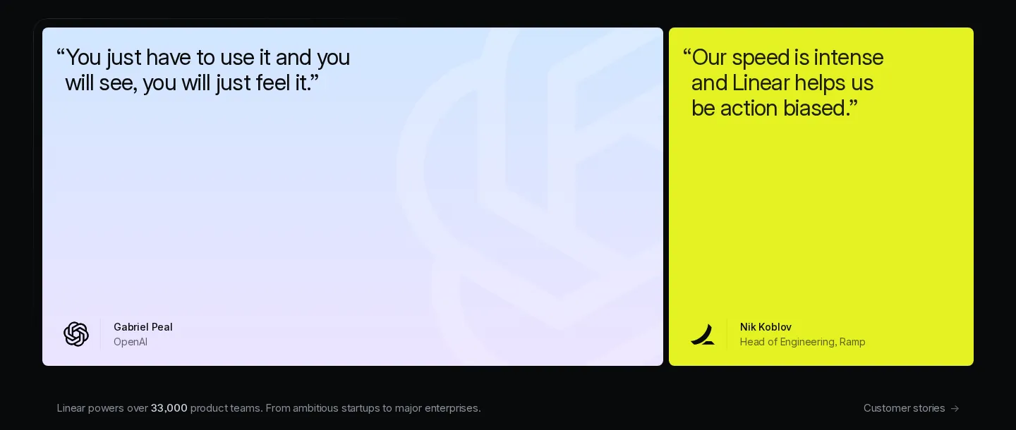
A row-brightness scan of the full-page capture (median row luminance 10 of 255 — this is a dark page) finds exactly one sustained bright band: the two testimonial cards, 84–89% of the scroll. Card one — Gabriel Peal, OpenAI: "You just have to use it and you will see, you will just feel it." Fifteen words, nothing a reader can verify. Card two — Nik Koblov, Ramp: eleven words on speed, no number. The page's only quantified proof — "Linear powers over 33,000 product teams" — sits beneath them in body-text gray.
By luminance, these cards are the loudest moment on the page, and they spend it on feel. The OpenAI mark does real work; the sentence next to it adds nothing a founder can check.
RecommendationKeep the cards, upgrade the cargo. Swap one quote for a line carrying an operational number, and promote the 33,000 figure out of gray body text into the bright tier.
In the lab, the LCP image is lazy.
Lighthouse 12.8.2, median of 3 runs, re-confirmed against the live page 2026-06-14 (Chromium 148.0.7778.96). It pins the LCP element to the hero frame image, and Lighthouse's own "Largest Contentful Paint image was lazily loaded" audit fails on every run; in the captured DOM, all three 1920×1080 frame images ship loading="lazy", and one — a grain texture rendered at 8% opacity — is requested at quality 95 and double DPR.
These are throttled lab numbers, not field data; Linear's real-user metrics may look different, and we can't see them. But lazy-loading the LCP image costs every visitor something, and the contrast with CLS 0 is the tell: this team measurably sweats layout stability — loading priority hasn't had the same pass.
Recommendationfetchpriority="high" and eager loading on the hero frame image; serve the 8%-opacity grain at a compressed tier or generate it in CSS; re-run the lab.
Twenty-three mentions of agents, no on-ramp.
"agent / agents" rendered on the page ×23 (×24 in the markup — the 24th is the h1's screen-reader copy) · sentences addressed to non-agent teams 0
The page renders "agent" or "agents" 23 times — 24 in the source, where the h1 ships a duplicate copy for screen readers. The h1 commits to them, the subhead names "the AI era," two chapter headings reference agent workflows. What the page never includes: a sentence addressed to a team that hasn't adopted agent workflows yet.
This is a deliberate, species-level bet — the h1 commits to it outright. Linear presumably knows what share of its 33,000 teams already run agents; we don't. From outside, the exposure is visible: a 2026 buyer who runs product development without agents reads a page describing someone else's workflow.
RecommendationOne bridging line under the manifesto — the feature set on this same page (Issues, Cycles, Customer Requests) predates the agent era and works without one. Test whether it lifts signups from non-agent traffic without diluting the bet.
Alternative directions
explorations, not prescriptionsThree of the observations earn a redesign pass. Each is framed as something we'd test — Linear's own data may vindicate the control.
Alt A · Observations 1 + 2
A hero that asks.
The campaign banner moves to a slim ribbon above the nav; one "Get started" pill lands beneath the subhead; type scale, mockup, and spacing stay Linear's. The point to prove: a single button doesn't cost this hero its restraint. The 8-word claim keeps its air — the page just stops delegating its only ask to the nav corner.
Alt B · Observation 3
A proof beat at the midpoint.
After the Build chapter — the page's middle — a one-line stat strip in the same register as the section paragraphs: customer name, one operational number, "Customer stories →". It breaks the 7,600-pixel evidence gap at its center and costs one component.
Alt C · Observation 4
Quote cards that carry numbers.
Identical layout, identical luminance; one of the two quotes swapped for a quantified customer claim, and the 33,000-teams line promoted into the card tier. Any illustrative number is drawn from Linear's public customer stories and labeled as such — we don't put invented numbers in a real customer's mouth, even in a mockup.
What we'd test first
one experiment, scopedThe hero ask, before anything else. Variant: today's hero plus a single "Get started" button under the subhead — Alt A without the ribbon move, the smallest possible diff. Control: the live hero. Primary metric: landing → signup-start rate. Guardrails: clickthrough on the campaign link and hero scroll-past rate, to catch cannibalization of the launch story.
We'd pick this test because the hero is the one section every visitor renders, the change is one component, and the result adjudicates the page's central choice: does restraint outconvert asking?
Why this matters
zoom outLinear's landing shows what conviction looks like when it's earned: a 216-word persuasion layer, one continuous demo doing the explaining, zero layout shift under animation. The gaps we measured — the unasked hero, the 70% evidence gap, a lazy-loaded LCP — are choices a brand with 33,000 teams can afford, and their team may have data that justifies every one.
Most B2B SaaS landings don't get that margin. Without brand gravity, the hero has to ask, the proof has to arrive early, and the numbers have to be on the page. The discipline here is copyable. The gravity isn't. Copy the right one.